The maps that could predict your bushfire risk
By Bianca Hall
A bushfire is bearing down on the sleepy seaside town where your family is spending the summer holidays. Do you stay or do you go?
A project under development by Australia’s fire chiefs and scientists from universities across the country aims to make that decision easier by putting the information relied on by emergency services into the hands of the public.

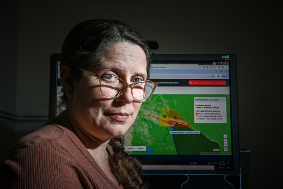
There’s an app for that: Dr Amy Griffin hopes the new technology will save lives in bushfires.Credit: Justin McManus
Interactive, dynamic maps predicting bushfires’ spread and trajectory could be on mobile phones within years.
In the years since the Black Summer bushfires of 2019-20, repeated inquiries have identified poor mobile phone reception during catastrophic fires – and the timeliness of emergency warnings – as systemic issues.
Authorities have warned of increased bushfire risks this summer, especially in NSW, Victoria, South Australia, Northern Territory and Western Australia.
Conditions in western Victoria have been compared with those at the start of Black Summer, but there are low soil moisture levels and dry vegetation across the southern flank of the mainland.
The need for clear and dynamic maps that predict the spread and behaviour of large bushfires was thrown into stark relief during Black Summer, when 24.3 million hectares were burnt and 34 people died (another 443 people died from smoke inhalation and other bushfire-related causes).
As separate fires began to merge and create a megafire, the Rural Fire Service grew increasingly concerned that residents and holidaymakers in NSW didn’t appreciate the dangers of the situation.
The RFS took a novel approach and began publishing predictive maps as the tragedy unfolded. Once the last of the fires were out, fire and emergency services agencies across the country reflected on how the predictive maps could be developed to give communities not only information about bushfires’ spread but predictions about where they could go next.
For the past two years, researchers from RMIT, Deakin University and QUT, as well as emergency management personnel from every fire agency in the country, have been working to build dynamic predictive maps.
Given the high stakes, with people’s lives on the line, the testing has been rigorous.
Researcher Dr Amy Griffin from RMIT University, who works on the project, said the most recent testing involved eye-tracking technology to monitor how people looked at the maps, and whether more detailed maps created confusion and indecision. They hope to have the final design complete by 2026.
Asked whether researchers had considered the possibility of people relying on incorrect bushfire predictions, Griffin poses a different scenario.
During the Beaufort fires in Victoria in February, authorities published a static map that predicted the bushfire spread.
“In that particular case, the prediction went in all directions, and their point there was really to just make people aware of the intensity of the risk and the fact that they couldn’t predict accurately which direction it was going to go,” she said.
“Until we have a crystal ball about weather prediction, we can’t actually solve that problem. But what we can do is we can help people understand that uncertainty, and in times when we have great uncertainty, they need to recognise that and adapt their behaviour to account for the fact that there’s more uncertainty than usual.”
Climate change is increasing the frequency and severity of bushfires.
Last month, the CSIRO and Bureau of Meteorology released new climate data showing Australia’s average temperatures have risen by 1.5 degrees since records began, while the average number of extreme bushfire days has risen by as many as 25 days a year in parts of the country.
Start the day with a summary of the day’s most important and interesting stories, analysis and insights. Sign up for our Morning Edition newsletter.
correction
An earlier version of this story incorrectly suggested the maps under construction would show the real-time spread of bushfires. It’s been updated to say it would be predictive information.